
What Makes a High-Converting Product Page? 15 Questions Answered
FAQ · Product pages
Your ads can be great and still lose money if the product page doesn't do its job. These are the 15 questions sellers ask most about product pages that convert, answered plainly: what goes above the fold, which images you need, how to present the offer, how to add proof honestly, and how to make it all work on a phone.
Updated October 2026 · By the CreaX team
Key takeaways
- ✓A converting product page repeats the ad’s promise, shows the real product clearly and makes the price, offer and buy button visible without scrolling on a phone.
- ✓Order beats decoration: promise → proof → details → objections → guarantee. Most fixes are about clarity, not design.
- ✓Use only honest proof: real reviews, real photos and guarantees you actually honor. Invented numbers and testimonials put your ad account and your store at risk.
- ✓Test on a real phone before every launch. If your traffic comes from Meta or TikTok ads, assume buyers are on mobile.
In this guide
TL;DRThe short answer
A high-converting product page does three jobs, in this order. First, it confirms the click: the visitor instantly sees the product and the promise they saw in the ad. Second, it removes doubt: clear images, honest proof, shipping and returns, and answers to the obvious questions. Third, it makes buying easy: a visible price, a simple offer and a buy button that's always within reach.
Everything else (colors, fonts, animations, countdown timers) is secondary. If a page does those three jobs well, it has a fair chance. If it doesn't, no design trick will save it.
Q1–Q3Above the fold
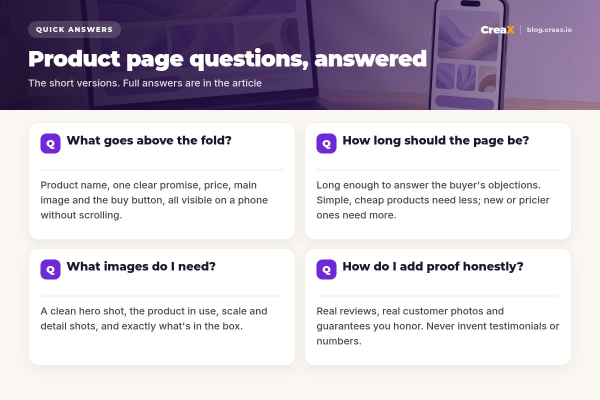
1. What should go above the fold?
“Above the fold” is what a visitor sees before scrolling. On a phone that's a small space, so be ruthless. It should contain:
- The product name written for humans, not a supplier SKU.
- One clear promise that matches the ad: the main outcome or reason to buy.
- The hero image showing the actual product clearly.
- Price and offer, including any bundle or discount.
- The buy button, plus one line of reassurance such as delivery time or returns.
2. How should I write the product page headline?
Lead with the outcome, then name the product. “Cold coffee all morning, anywhere: the insulated travel mug” beats “Stainless Steel Vacuum Tumbler 500ml”. Most importantly, repeat the angle of the ad that sent the traffic. If the ad was about leaks in a gym bag, the headline shouldn't be about style. Message match is one of the simplest wins on any page.
3. Where should the buy button go?
Visible on load, and again after each major section. On mobile, a sticky “Add to cart” bar at the bottom of the screen is a common and effective pattern. Use one clear action per page (don't make the visitor choose between “Buy now”, “Learn more” and “Join the newsletter”), and make the button text specific: “Add to cart” or “Get yours” is better than “Submit”.
Q4–Q6Images and video
4. What product images do I need?
Think of images as answers to questions the buyer can't ask you in person. A solid set includes:
- Hero shot: clean, well-lit, product filling the frame.
- In-use shot: the product doing its job in a real-looking setting.
- Scale shot: in a hand, on a desk, next to a common object.
- Detail shots: materials, buttons, textures, stitching.
- What’s in the box: every item the customer receives.
- Benefit graphic: one or two images with short callouts for key features.
5. Do I need video on a product page?
You don't need it, but it often helps, especially for products that move, transform or solve a problem you can show. A short vertical clip of the product in use (the same style as a UGC ad) answers “how does it work?” faster than paragraphs. If you already have UGC-style ads, reuse the best one on the page. Our explainer on what a UGC video ad is covers the format.
6. Can I use AI product photos on my product page?
Yes, for lifestyle and studio-style scenes, as long as the product itself is accurate. Backgrounds, props and lighting can be generated; the product's shape, color, size, label and included parts must stay true. Keep at least one true-to-life photo so buyers can see exactly what they'll receive. Our guide to the best AI product photo generators compares tools for this.
!Accuracy beats beauty
Get a product page and matching ads from one link
CreaX turns a product link or image into a publish-ready landing page, studio creatives and UGC video ads, so the page repeats the ad's promise from the start.
Q7–Q9Offer, price and policies
7. How should I present the price and offer?
Make the price impossible to miss, and make the offer easy to understand in one glance. If you run a discount, show the original and the sale price only if the original is a real price you have charged. If you offer bundles, present them as clear options (for example “1 mug”, “2 mugs, save on the second”) with the savings stated in currency, not vague claims.
8. Should I offer bundles or quantity discounts?
Often, yes, when the product is something people buy more than one of (gifts, consumables, items for several rooms or family members). Bundles can raise order value, which gives your ads more room to be profitable. Keep the choice simple: two or three options, with one clearly marked as the most popular only if it actually is.
9. Where do shipping, delivery time and returns go?
Near the buy button, in plain words. “Ships in 1–2 business days, delivered in 5–8” (with your real numbers) and “30-day returns” (with your real policy) answer the two questions that stop many buyers. Link to the full policies, but don't hide the basics in the footer. Unclear delivery times are a common reason for abandoned carts and disputes.
Q10–Q11Trust and proof
10. How do I add social proof honestly?
Use proof you can stand behind:
- Real reviews from real buyers, imported or collected with a reviews app. A new product can launch without reviews; that's normal.
- Customer photos and videos shared with permission.
- Guarantees you honor: returns, warranties, satisfaction promises.
- Clear business information: contact details, a real support email, who you are.
Never invent testimonials, star ratings, “as seen on” logos, sales counts or numbers. Besides being dishonest, fabricated proof can violate consumer protection rules and ad platform policies, and it's an easy way to lose an ad account. If you are worried about weak conversion, see our list of creative fixes for ads that don’t convert.
11. Do urgency and scarcity tactics work?
Real urgency works: a sale that genuinely ends on a date, or stock that is genuinely limited. Fake urgency (timers that reset, “only 3 left” on unlimited stock) erodes trust quickly and can breach consumer rules in many countries. If you use urgency, make it true and explain it.
Q12–Q14Copy and structure
12. How long should a product page be?
As long as it takes to answer the buyer's real objections, and no longer. A cheap, familiar product (a phone stand) needs a short page. A new or more expensive product (a posture corrector, a skincare device) needs more explanation, proof and FAQs. A reliable structure for longer pages is: promise → how it works → benefits → proof → details/specs → FAQ → guarantee → final call to action.
13. Should I write about features or benefits?
Both, in that order: benefit first, feature as proof. “Stays cold for your whole commute” is the benefit; “double-wall vacuum insulation” is the feature that makes it believable (only claim what the product really does). Put specs in a short, tidy table for the people who want them.
| Feature (what it is) | Benefit (why it matters) |
|---|---|
| Double-wall insulation | Drinks stay cold through a long commute |
| Leak-proof lid with lock | Safe to throw in a gym bag or backpack |
| Fits standard cup holders | Works in your car without spills |
| Dishwasher-safe parts | Easy to clean, less hassle every day |
Example only: claim what your product really does, using your supplier's verified specs.
14. Should a product page have an FAQ section?
Yes. An FAQ handles objections without cluttering the main story: sizing, compatibility, materials, delivery, returns, how to use it, what's included. Write questions in the buyer's words, keep answers short, and update them with questions you actually receive from customers and ad comments.
Q15Speed and mobile
15. How fast does the page need to be, and what about mobile?
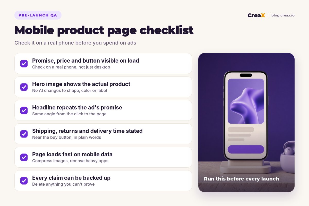
Fast enough that the visitor never waits for the hero image or the buy button. Practical steps: compress images, avoid autoplaying heavy videos above the fold, remove apps and scripts you don't use, and test on mobile data, not office Wi-Fi. Check the page on a real phone: text readable without zooming, buttons easy to tap, nothing covering the buy button.
MistakesCommon product page mistakes to avoid
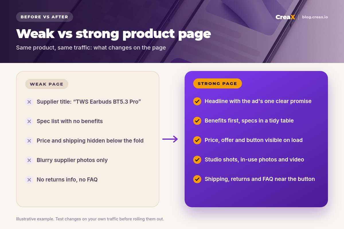
- Copy-pasting the supplier listing: SKU-style titles, broken English and spec dumps.
- A mismatch with the ad: the ad sells one angle, the page talks about another.
- Hidden costs: shipping or fees revealed only at checkout.
- Too many choices: five variants, three bundles and an upsell before the visitor understands the product.
- Fake proof: invented reviews or numbers.
- Desktop-only design: tiny text, a button below three screens of images.
ChecklistProduct page checklist you can copy
Before you send traffic
- ✓Headline states one clear promise that matches the ad angle
- ✓Hero image shows the real product; at least one true-to-life photo on the page
- ✓Price, offer and buy button visible on load on a phone
- ✓Benefits first, specs in a short table
- ✓In-use, scale, detail and what's-in-the-box images
- ✓Shipping time, delivery estimate and returns stated near the button
- ✓Only real reviews, photos and guarantees; no invented numbers
- ✓FAQ answers sizing, compatibility, use and delivery questions
- ✓Page loads quickly on mobile data; sticky buy button on mobile
- ✓Every claim checked against what the supplier can prove
CreaXHow CreaX helps you build pages that convert
Building a page like this from scratch takes time most sellers don't have, especially when you test several products a week. CreaX is an all-in-one AI ecommerce creative OS: paste a product link or upload a product image, and in about 60–120 seconds it generates a publish-ready landing page, studio ad creatives, UGC-style video ads and a multi-tenant store.
Because the page and the ads come from the same product input, they share the same promise, which is exactly the message match this guide recommends. You still review and edit the page (especially claims, shipping and returns, which only you can confirm). For a walkthrough, see how to turn a product link into a landing page without a designer. Plans start at $4.99/month for 2,000 credits.
Turn your next product link into a page that sells
Get a publish-ready landing page plus matching studio creatives and UGC video ads in about 60–120 seconds.
FAQMore questions sellers ask
Q.What is the difference between a product page and a landing page?
Q.How many images should a product page have?
Q.Do I need reviews before I launch a product?
Q.Should my product page match my ad exactly?
Q.Can CreaX build the product page for me?
Ready to launch a page that converts?
One product link, about 60–120 seconds: landing page, studio creatives and UGC video ads that tell the same story.
This guide is published by CreaX. It contains general best practices, not guaranteed results, and no invented statistics. Always check claims, policies and platform rules for your own products and markets.