
How to Make an "Us vs Them" Comparison Ad
How to · Comparison ads
An us vs them comparison ad puts your product next to the alternative and lets the buyer see the difference in one glance. Done well, it's one of the clearest ad formats in ecommerce. Done badly, it gets rejected, invites complaints or just looks petty. Here's how to make an honest one in five steps, with a worked example and a checklist.
Updated October 2026 · By the CreaX team
Key takeaways
- ✓Compare against a category or the old way (disposable cups, a manual method), not a named brand, unless you've had legal advice.
- ✓Use four rows buyers care about and you can prove with specs, tests, reviews or a demo.
- ✓Design a two-column split that reads in one second, with your product on the right.
- ✓Test it against a plain benefit ad for the same product and judge on cost per purchase.
In this guide
OutcomeWhat you'll have at the end
By the end of this guide you'll have one static comparison ad and, ideally, a short video version, plus a plain benefit ad to test against. The comparison ad shows two columns: the alternative on the left, your product on the right, and four rows that make the difference obvious. Every row will be something you can back up if a customer, a platform reviewer or a regulator asks.
Comparison ads work because they do the buyer's thinking for them. Instead of asking people to imagine why your product is better, you show them, side by side. That's especially useful for products that replace an existing habit: reusable instead of disposable, a gadget instead of a manual chore, one product instead of three.
PrepWhat you need before you start
- A clear product advantage that's real: a spec, a material, a feature, a cost over time.
- Proof for each advantage: product specs, your own test, a demo clip or genuine reviews.
- Good product images or a product link you can turn into creatives.
- A benefit ad for the same product to test against. If you don't have one yet, make it alongside the comparison.
!Check the rules first
Who you compare withStep 1: Pick the 'them'
The safest and often most persuasive “them” is a category or the old way of doing things, not a specific brand:
| Your product | A strong 'them' | A risky 'them' |
|---|---|---|
| Reusable insulated cup | Disposable paper cups | A named coffee-cup brand |
| Electric spin scrubber | Scrubbing by hand | A competitor's scrubber, by name |
| All-in-one skincare stick | A three-product routine | A named skincare line |
| Posture corrector | Slouching at your desk | A rival brand's product photo |
Category comparisons are easier to prove and less likely to trigger complaints.
Category comparisons also match how buyers think. Someone scrolling past a reusable cup ad isn't choosing between two cup brands; they're deciding whether to keep buying disposable cups. Speak to that decision. If you're not sure which angle to lead with, our guide on testing ad angles for a new product helps.
What you compareStep 2: Choose 4 honest rows
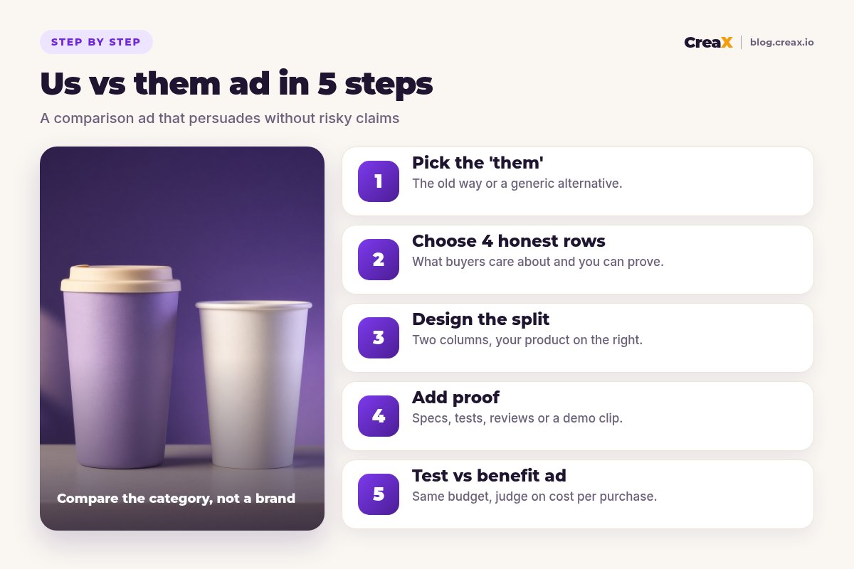
Four rows is a good default: enough to make the case, few enough to read in a second on a phone. For each candidate row, ask three questions:
- Does the buyer care? “Keeps drinks hot” matters. “Lid has 3 parts instead of 4” usually doesn't.
- Can I prove it? You need the spec, a test or a demo, not a feeling.
- Is it fair to the other side? Don't pick a row where the comparison is rigged.
Mix row types for a stronger ad: one performance row (keeps drinks hot), one cost or waste row (no cup to throw away), one experience row (doesn't go soggy), and one convenience row (fits standard cup holders, if true). It's fine to include a row where the alternative wins, such as “no washing up”. It makes the ad more believable.
Turn your product link into ad creatives
CreaX generates studio ad creatives, UGC-style video ads and a landing page from one product link in about 60–120 seconds, a fast starting point for your comparison test.
Make it readableStep 3: Design the split
The design goal is simple: the difference should be obvious in one second, even with the sound off and the ad half-scrolled.
- Two columns, the alternative on the left, your product on the right (the eye usually ends on the right).
- Clear labels at the top of each column: “Disposable cups” vs “Your cup”.
- Icons for each row: a simple check, cross or neutral mark, large enough to read on a phone.
- Calm vs warm styling: muted colors for the alternative, your brand colors for your product. Don't make the alternative look deliberately ugly.
- Short text: three to five words per row.
- Sizes: square and vertical versions for feeds and stories.
For video, show the two options side by side or one after the other, and narrate only the rows you can demonstrate. Our guides on product demo video ads without filming and carousel ads for ecommerce cover other formats for the same comparison.
Back it upStep 4: Add proof
A comparison ad makes claims, so the proof should be close by: in the ad, in the caption or on the landing page.
| Proof type | What it looks like | Best for |
|---|---|---|
| Spec | The product's stated insulation time or capacity | Performance rows |
| Your own test | A simple, fair side-by-side you filmed | Video ads |
| Demo | The product doing the job in real time | Experience rows |
| Reviews | Genuine customer quotes, with permission | Trust and experience |
| Cost math | Clearly explained, with your assumptions shown | Cost rows |
Keep the source for every claim on file.
The landing page should continue the comparison with more detail. If the ad says “keeps coffee hot for your commute”, the page should show the spec and how you tested it. A page that ignores the ad's promise loses buyers; see what makes a high-converting product page.
Measure itStep 5: Test vs a benefit ad
A comparison ad isn't automatically better than a simple benefit ad. Test them against each other:
Same product, same offer
Same budget
Same landing page
Judge on cost per purchase
Keep the learning
If neither ad works, the issue may be the product, the offer or the page rather than the format. Our guide on Facebook ads that are not converting lists what to check.
Make the comparison and the benefit ad today
Paste one product link into CreaX for studio creatives, UGC-style videos and a matching landing page, then test both formats.
ExampleWorked example: a reusable insulated cup
You sell a reusable insulated coffee cup. The “them” is disposable paper cups, not a named brand. Four rows, each provable for this example product:
| Row | Disposable cups | Reusable cup | Proof |
|---|---|---|---|
| Keeps coffee hot | Not insulated | Insulated, double wall | Product spec + filmed test |
| Waste | One cup per coffee | Reused every day | Self-evident |
| Soggy or leaky | Can go soft | Sealed lid | Demo clip |
| Washing up | None | Rinse after use | Honest row |
Illustrative example. Use your own product's real specs and tests.
The static version uses the reusable cup in warm brand colors on the right and a plain paper cup in neutral light on the left. The video version shows both cups filled at the same time, then checked after the commute. The fourth row admits the reusable cup needs washing. That small honesty makes the other three rows more credible.
With CreaX, you'd paste the cup's product link to get studio product images and static ads in several sizes, UGC-style videos with an AI presenter and a landing page, then use those images in your comparison layout. CreaX gives you the product creatives fast; the comparison rows and proof are your job. Read more about studio ad creatives from a product photo.
AvoidMistakes to avoid
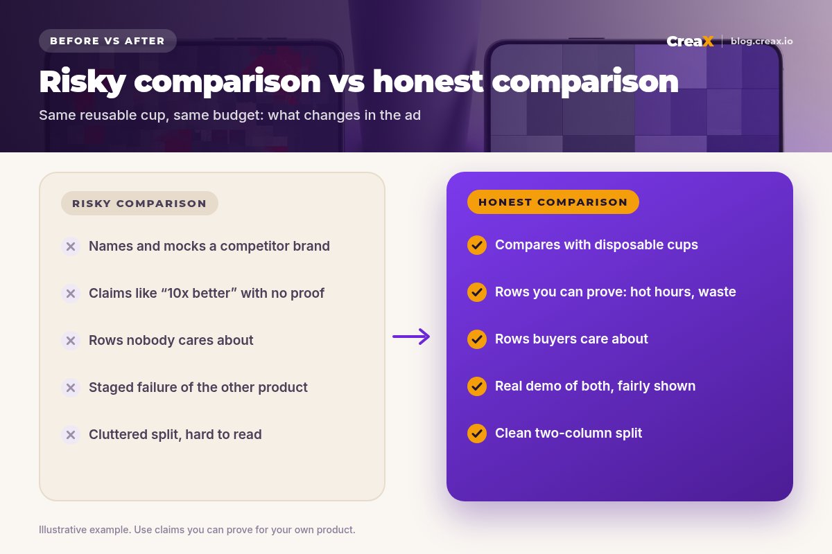
- Mocking a named competitor. Legal risk, platform risk, and it often looks insecure.
- Claims without proof. “10x better” with nothing behind it invites rejection and refunds.
- Rigged comparisons. Showing the alternative used wrongly or staged to fail.
- Too many rows. Eight rows on a phone screen is a wall of text.
- Only one format. Make a static and a video version so you can see which works.
- Never testing against a benefit ad. Without a control, you don't know if the comparison helped.
⚖When a comparison ad isn't the right format
Before launchChecklist
Comparison ad checklist
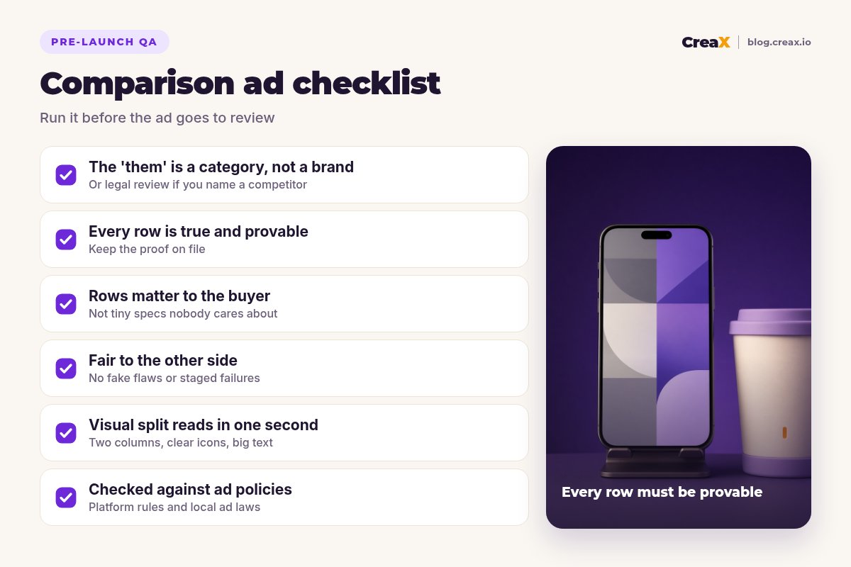
- ✓The 'them' is a category or the old way, not a named brand
- ✓Four rows, each one the buyer cares about
- ✓Proof on file for every row
- ✓At least one honest row where the alternative is fine
- ✓Two columns, your product on the right, readable in one second
- ✓Square and vertical sizes
- ✓Landing page continues the comparison
- ✓Checked against platform policies and local ad rules
- ✓A benefit ad ready as the control
FAQFrequently asked questions
Q.Can I name a competitor in a comparison ad?
Q.How many rows should a comparison ad have?
Q.Should my product always win every row?
Q.Do comparison ads work as videos?
Q.What if my comparison ad gets rejected?
Q.Can CreaX make the comparison layout for me?
Ready to test your comparison ad?
One product link, about 60–120 seconds: studio creatives, UGC-style video ads and a landing page that tells the same story.
This guide is published by CreaX. We describe other tools from their own public websites as of October 2026, avoid invented scores or prices, and recommend checking each vendor's site for current features and plans.