
How to Design a Static Ad That Converts (Layout Rules)
How to · Static ad design
Good static ad design is mostly about what you leave out. A static ad that converts says one thing, shows the product big enough to recognise on a phone, and makes the next step obvious. This guide gives you the layout rules, a five-step process and a checklist you can run before every launch.
Updated October 2026 · By the CreaX team
Key takeaways
- ✓One message per ad. If you want to test three benefits, make three ads, not one busy one.
- ✓Pick a layout before you pick colours. Hero product, split, problem-solution and offer-led layouts cover most ecommerce statics.
- ✓Design for the phone. Check every static at thumbnail size: product recognisable, headline readable, contrast strong.
- ✓Vary one thing at a time. Three variations that change only the headline, the image or the layout teach you more than ten random ones.
In this guide
The goalWhat you'll have at the end
By the end of this guide you will have three finished static ads for one product, each built around a single message, in the sizes your placements need, and ready to test against each other. You will also have a short set of layout rules you can reuse for every product after this one.
Static ads are still worth the effort. They are quick to make, quick to change, and they show you which message works before you spend more on video. If you are deciding where to start, our guide on static vs video ads: which to make first walks through that choice.
★What 'converts' means here
PrepWhat you need before you start
- A clear product photo. A clean cut-out or a simple lifestyle shot. Supplier photos work, but studio-style shots usually look more trustworthy.
- The one buyer problem you solve. Write it as the customer would say it, not as a feature list.
- Your offer, if you have one. Free shipping, a bundle, a guarantee. Only include what is actually true.
- Your brand basics. One or two colours, one font for headlines, your logo file.
- The placement sizes. For Meta and TikTok feeds, 1:1, 4:5 and 9:16 cover most needs. See our guide to ecommerce ad creative sizes.
- The landing page the ad will send people to. Open it while you design so the headline and the page say the same thing.
Message firstStep 1: Pick one message
Most weak statics fail before anyone opens a design tool. The brief says "show that it is comfortable, durable, eco-friendly and on sale", and the result is an ad that says nothing clearly. A person scrolling gives your ad a moment. One idea fits in that moment. Four do not.
Write down every reason someone might buy, then pick the one that matters most to the audience you are targeting with this ad. The rest are not wasted. They become the next ads you test.
Ways to find the message
- Read your reviews and support emails. The words customers use are often better headlines than anything you write.
- Name the problem, not the feature. "Coffee still hot at your 3pm meeting" beats "double-wall insulation".
- Look at what your page already promises. The ad should open the same conversation the page continues.
- Check your angle against competitors. If every ad in your niche says the same thing, a different angle may stand out more than a prettier design.
If you need more help with angles, read how to test ad angles for a new product.
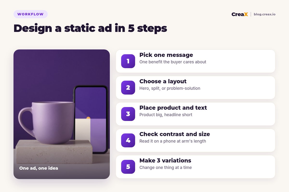
StructureStep 2: Choose a layout
Pick the layout before colours, fonts or effects. A layout is just a decision about what the eye sees first, second and third. These five cover most ecommerce static ads:
| Layout | What it looks like | Best for |
|---|---|---|
| Hero product | Product large in the centre, short headline above or below | Products that look good and sell on sight |
| Split (problem / solution) | Two halves: the frustration on one side, the product fixing it on the other | Products that solve an obvious, visible problem |
| Benefit callouts | Product in the middle, 2–3 short labels pointing at features | Products where a detail matters (a zip, a strap, a material) |
| Offer-led | Offer is the headline, product supports it | Sales, bundles and seasonal promos |
| Us vs them | Your product next to a generic alternative, simple comparison | Clear advantages; see us vs them comparison ads |
Layout options for ecommerce statics. Pick the one that fits your single message.
Match the layout to the message from Step 1. A comfort message suits a hero product shot in use. A "stops leaks" message suits a split layout. An offer message suits an offer-led layout. If you cannot decide, start with the hero product layout: it is the simplest and hardest to get wrong.
The visual hierarchy rule
Whatever layout you choose, every static ad needs a clear order: one thing the eye lands on first (usually the product or the headline), one thing second, and the call to action or offer third. If two elements fight to be first, make one of them smaller.
Get studio static ads from one product link
Paste a product link and CreaX makes studio ad creatives in several styles, plus a matching landing page, so you can start from a clean layout instead of a blank canvas.
CompositionStep 3: Place product and text
Now place the elements. The goal is a design someone can understand in a glance.
Make the product the biggest thing
Write a headline of a few words
Use one headline font, two weights at most
Leave empty space around the product
Put the offer or CTA in one place
Keep text off the edges. Platforms put buttons, profile names and captions over parts of the image, especially in 9:16 placements. Keep important text and the product inside the centre of the frame, and check the platform's safe zones before launch.
!Keep claims provable
ReadabilityStep 4: Check contrast and size
This is the step most people skip, and it is where many good designs lose. A static that looks fine on a large monitor can be unreadable on a phone.
- Do the arm's-length test. Send the ad to your phone and hold it at arm's length. If you cannot read the headline or tell what the product is, make the text bigger or cut words.
- Check contrast. Dark text on a light background or light text on a dark background. Avoid text over busy parts of a photo; add a solid shape behind it if needed.
- Check the thumbnail. Shrink the ad to the size of a stamp. The product shape and one colour block should still be recognisable.
- Check each size. A layout that works in 1:1 may crop the headline in 9:16. Look at every version, not only the first one.
TestingStep 5: Make 3 variations
One ad is a guess. Three ads are a small test. The trick is to change one thing at a time, so you know what made the difference.
| Variation | What changes | What stays the same |
|---|---|---|
| A (control) | Your best version from Steps 1–4 | - |
| B (headline) | A different headline for the same message | Image, layout, offer |
| C (image or layout) | A different photo or layout | Headline, offer |
A simple three-ad test. Change one element per variation.
Run them to the same landing page and audience, and judge them on the metric that matters to you, such as cost per purchase, rather than likes. Our guide on how many ad creatives to test per product covers budget and timing. When one wins, make new variations of the winner and switch off the rest.
Build three variations without a designer
CreaX turns one product link into studio static ads, UGC-style video ads and a landing page, so you can test headlines and layouts side by side.
ExampleWorked example
Say you sell a double-wall ceramic travel mug. Your first draft has four benefits, a small photo in the corner and a long headline in a thin font. Here is how the five steps change it:
- Message: reviews mention coffee staying warm through a long morning, so that becomes the one message.
- Layout: hero product. The mug fills most of the frame on a calm cream background.
- Text: a short headline such as "Still warm at your next meeting" (only if your product actually keeps drinks warm that long) and one line with a true offer.
- Check: on the phone the thin font disappears, so you switch to a bold weight and move the text off the busy part of the photo.
- Variations: B tests a gift headline, C tests a split layout with a cold paper cup on the left and the mug on the right.
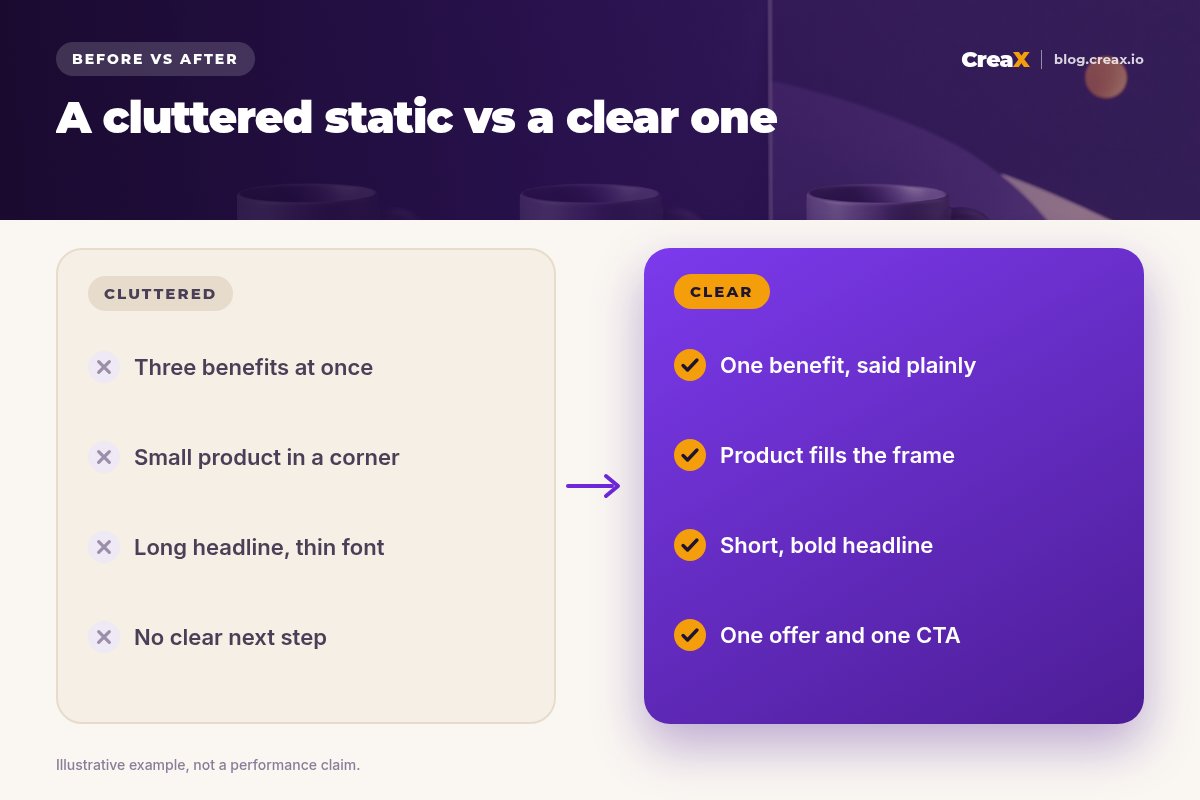
Nothing in the improved version is fancy. It is clearer, and clearer ads are easier to judge in a test.
PitfallsMistakes to avoid
- Too many messages. The most common problem. Split them into separate ads.
- A tiny product. If people cannot see what you sell, the best headline will not help.
- Text over busy backgrounds. Add a solid shape or move the text.
- Badges everywhere. 'Best seller', 'New', '50% off' and a star rating all at once look like spam. Use one, and only if true.
- Ignoring safe zones. Platform buttons cover the edges of vertical placements.
- A mismatched page. If the ad promises warm coffee and the page leads with colours, people bounce. Check why Facebook ads are not converting for more on this.
- Judging too early. Give each variation enough spend to compare before deciding.
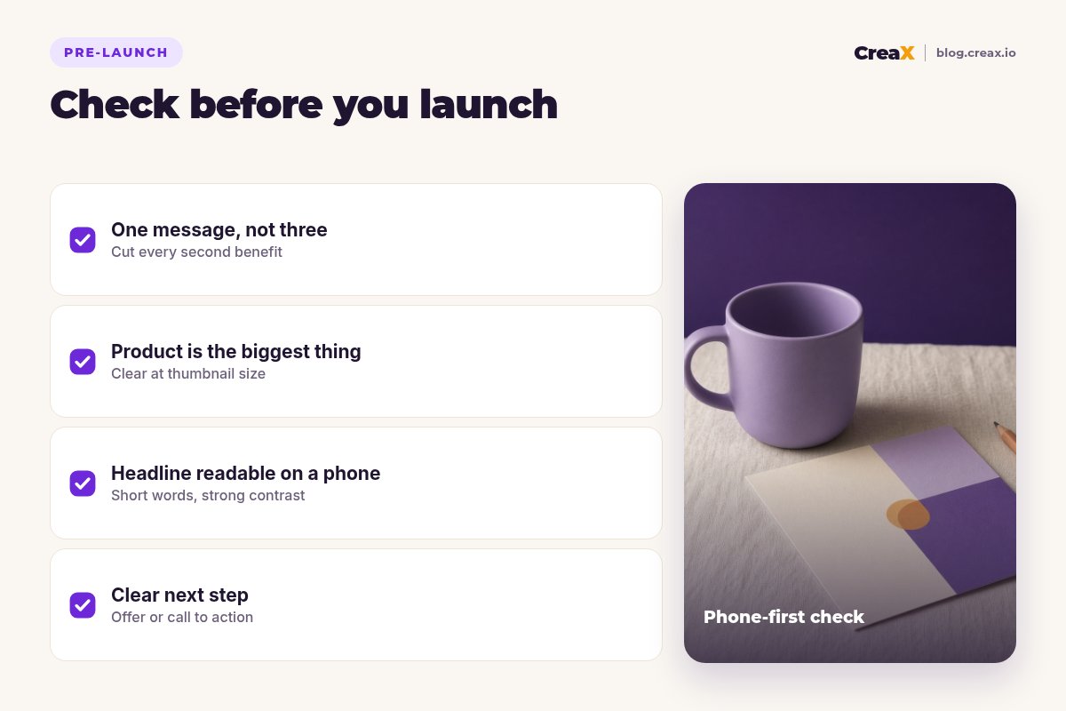
Copy thisChecklist
Before every static ad goes live
- ✓One message that a buyer would say in their own words.
- ✓A layout chosen on purpose: hero, split, callouts, offer-led or us vs them.
- ✓Product is the biggest element and recognisable at thumbnail size.
- ✓Headline of a few words, bold, high contrast.
- ✓One offer or CTA, and every claim is true.
- ✓Important text inside the safe zone in every size (1:1, 4:5, 9:16).
- ✓Ad promise matches the landing page.
- ✓Three variations, each changing one thing.
FAQFrequently asked questions
Q.What makes a static ad convert?
Q.How much text should a static ad have?
Q.Which size should I design first?
Q.Should I put the price in a static ad?
Q.Do I need a designer for static ads?
Q.Can AI tools make static ads for me?
Make your next static ad in minutes
One product link in, studio static ads, UGC-style video ads and a matching landing page out, in about 60–120 seconds.
This guide is published by CreaX. We describe other tools from their own public websites as of October 2026, avoid invented scores or prices, and recommend checking each vendor's site for current features and plans.