
CreaX Ad Styles Explained: Classic, Humble Orbit, Punch, Luxe and Meta Feed
Feature explainer · Ad styles
CreaX ad styles decide how your static ads look: the layout, the mood and how the product, headline and proof points sit together. There are five: Classic, Humble Orbit, Punch, Luxe and Meta Feed, each available in four sizes. This guide explains what each style looks like, which products and angles suit it, and how to test styles against each other without wasting budget.
Updated October 2026 · By the CreaX team
Key takeaways
- ✓CreaX has five ad styles: Classic (the default), Humble Orbit, Punch, Luxe and Meta Feed.
- ✓Each comes in four sizes: 1:1 square, 3:4 portrait, 4:5 tall and 9:16 story.
- ✓Match the style to the product and the angle: calm and premium (Luxe), loud and benefit-led (Punch), clean and explanatory (Humble Orbit), feed-native (Meta Feed) or all-round (Classic).
- ✓Test styles one change at a time: same product, same offer, same page, different style.
In this guide
AudienceWho this is for: ecommerce sellers
This guide is for anyone who makes static ads for physical products: dropshippers testing a new product each week, media buyers who need fresh creatives on demand, brand owners without a designer, and agencies producing ads for several clients. If you already use CreaX, it will help you choose a style on purpose instead of by habit. If you do not, it shows what the studio ad creatives look like before you try them.
Why styles matterThe problem this solves
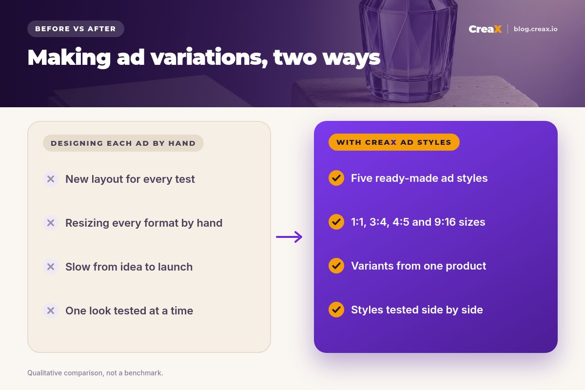
Static ads fail for two reasons: the angle is wrong, or the presentation does not fit the product and the buyer. A premium fragrance shown with a loud, discount-style layout looks cheap. A practical gadget shown in a moody, minimal layout can hide what it actually does.
Fixing that by hand means a new design for every idea, then resizing it for every placement. Most sellers end up testing one look, in one size, and never learn whether a different presentation would have worked better. Ad styles turn presentation into a quick choice, so you can test it like any other variable.
The kitWhat CreaX produces from one product link or image
CreaX is an AI ecommerce creative OS. Paste a product link or upload a product image and, in about 60–120 seconds, you get:
- Studio ad creatives: polished product photos and static ads, in the five ad styles below and four sizes.
- UGC-style video ads in 18, 30 or 45 seconds (3, 5 or 7 scenes).
- A publish-ready landing page at Simple, Detailed or Advanced level.
- A multi-tenant store for testing several niches or running client stores.
This article focuses on the static ads. For the video side, see CreaX UGC video ads explained, and for the page, the CreaX landing page generator.
StylesThe five CreaX ad styles
Here is what each style looks like, based on how CreaX describes them in the app, and where each one tends to fit. Treat the “good for” notes as starting points to test, not rules.
1. Classic
Classic is the default style. CreaX describes it as a premium gradient social ad with headline, price and CTA. The product sits large in the center, with a short headline above and a clear button-style call to action below. It is the all-rounder: clean enough for premium products, direct enough for a sales message.
- Good for: your first test of a new product, gifts, fragrance and home goods, any offer where the price is part of the pitch.
- Try it when: you have no idea yet which look will work. Classic is the baseline to beat.
2. Humble Orbit
Humble Orbit uses a muted, single-color field with open orbit arcs and four benefit icons around the product. The product stays in the middle and four short benefits circle it, which makes the ad feel calm and explanatory.
- Good for: products with several clear practical benefits, such as home textiles, kitchen tools, pet products and organizers.
- Try it when: buyers need to understand what the product does, not just see it.
3. Punch
Punch is the loud one: a bold, saturated brand-color field with an energetic headline and three proof chips under the product. It is built to stop the scroll with color and a big promise.
- Good for: supplements, snacks, gadgets and impulse buys, or any angle built on one strong benefit.
- Try it when: your current ads blend into the feed, or you are testing a bold hook.
4. Luxe
Luxe is a dark, premium beauty mood with a tiered plinth and glowing proof icons. The product stands on a pedestal under soft light, with a few elegant proof points beside it.
- Good for: skincare, fragrance, jewelry, watches and anything sold on quality rather than price.
- Try it when: you want the product to feel more premium, or the price is higher than average for the category.
5. Meta Feed
Meta Feed creates bold, graphic Facebook and Instagram feed ads with product proofs and a clear CTA. Expect strong graphic elements, proof points around the product and a button that is impossible to miss, the kind of layout people are used to seeing in their feeds.
- Good for: Facebook and Instagram feed placements, food and baby products, offers with several proof points.
- Try it when: you are running Meta campaigns and want a feed-native look. Our guide to Meta Advantage+ creatives explains how many to feed the algorithm.
| Style | Look and mood | Good starting point for |
|---|---|---|
| Classic | Premium gradient, headline, price, CTA | First tests, gifts, price-led offers |
| Humble Orbit | Muted field, orbit arcs, four benefit icons | Practical products with several benefits |
| Punch | Saturated color, big headline, three proof chips | Impulse buys, bold single-benefit angles |
| Luxe | Dark premium mood, plinth, glowing proof icons | Beauty, fragrance, jewelry, premium prices |
| Meta Feed | Bold graphic feed ad, proofs, clear CTA | Facebook and Instagram feed campaigns |
Style descriptions follow the CreaX app; the starting points are suggestions to test, not results.
See your product in all five styles
Paste a product link or upload an image and generate studio ad creatives in the styles and sizes you want to test.
FormatsThe four ad sizes
Every style comes in four sizes. The CreaX app labels them like this:
| Size | Label in CreaX | Typical placements |
|---|---|---|
| 1:1 | Square | Facebook and Instagram feed |
| 3:4 | Portrait | Pinterest and feed ads |
| 4:5 | Tall | Instagram and Facebook feed |
| 9:16 | Story | Stories, Reels and TikTok |
Placement notes follow the CreaX app. Check each platform's current specs before you launch.
A sensible default is 4:5 for feeds and 9:16 for Stories and Reels, with 1:1 as a fallback. If you are unsure, our guide to ecommerce ad creative sizes goes through each placement.
How it worksStep-by-step workflow
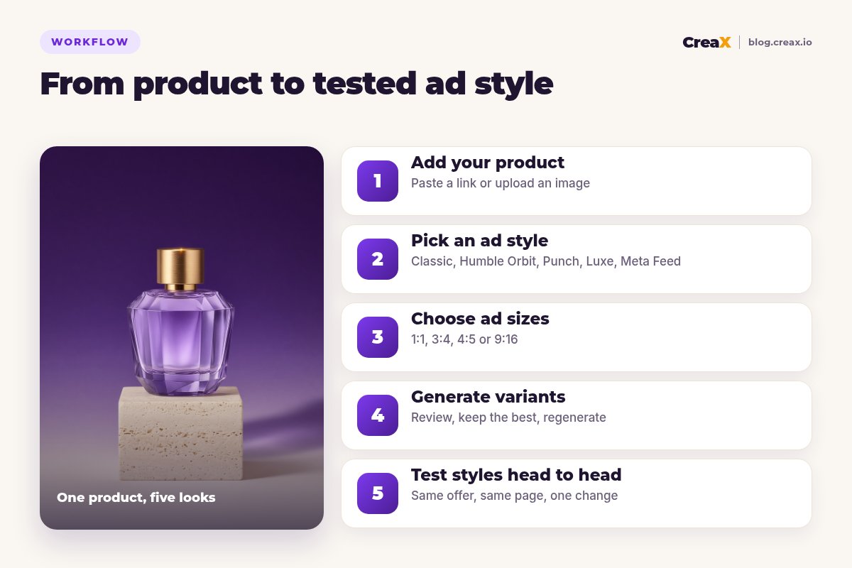
Add your product
Pick an ad style
Choose ad sizes
Generate variants
Test styles head to head
★Check before you launch
ExampleWorked example: one fragrance, three styles
Say you are launching a new eau de parfum with two angles in mind: “an everyday luxury you can afford” and “a gift that looks expensive”. Here is a simple style test:
| Ad | Style | Angle | Why test it |
|---|---|---|---|
| A | Classic | Everyday luxury, price visible | The baseline: clear product, price and CTA |
| B | Luxe | A gift that looks expensive | Dark premium mood supports the gifting angle |
| C | Punch | Everyday luxury, bold headline | Checks whether a louder look stops more scrolls |
An example test plan, not a result. Your product and audience decide the winner.
Generate each in 4:5 and 9:16, send all three to the same landing page, and give them the same budget. If Luxe wins on the gifting angle, generate fresh Luxe variations with new headlines next. Our guide on scaling winning creative variations covers what to do after you find a winner, and how many creatives to test per product helps you size the test.
PricingWhich plan fits (real CreaX prices)
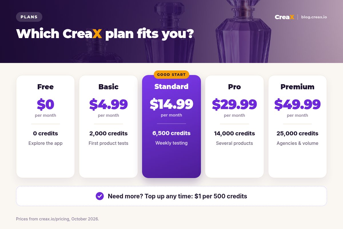
| Plan | Price / month | Credits | Good fit |
|---|---|---|---|
| Free | $0 | 0 | Look around the app first |
| Basic | $4.99 | 2,000 | Your first style tests |
| Standard | $14.99 | 6,500 | Testing styles for a new product every week |
| Pro | $29.99 | 14,000 | Several products or stores at once |
| Premium | $49.99 | 25,000 | Agencies and high-volume media buyers |
| Top-up | $1 | 500 | Extra credits when a test takes off |
Current plans on creax.io/pricing. The app shows the credit cost before you generate.
For a full breakdown of how credits work, see CreaX pricing and credits explained.
TipsTips for better results
- Start from a clean product image. Good input gives better studio creatives in every style.
- Keep one baseline. Always run Classic (or your current best) next to a new style so you know what you are beating.
- Change one thing at a time. Style, headline or size, not all three at once.
- Match style and angle. Luxe with a discount headline sends mixed signals; Punch suits a bold claim you can prove.
- Match the page. The landing page should feel like the ad. CreaX builds the page from the same product, which helps.
- Refresh winners. When a style wins, make new variations in that style before results fade. See signs of ad creative fatigue.
Find the style your buyers stop for
Generate studio ad creatives in five styles and four sizes from one product, then let a fair test pick the winner.
Honest limitsLimits and when to use other tools
Ad styles are fast and consistent, but they are not a replacement for every kind of design work:
- Pixel-level brand control. If every ad must follow a strict brand book down to the font and spacing, a design tool such as Canva or Figma gives you more manual control. See CreaX vs Canva for how the two compare.
- Complex campaign artwork. Multi-product catalogs, collages or illustrated campaigns are better made by a designer.
- Claims you cannot prove. No style fixes an untrue headline. Always check the text before you launch.
⚖Our take
FAQFrequently asked questions
Q.How many ad styles does CreaX have?
Q.Which CreaX ad style is best?
Q.What sizes can I export?
Q.Can I use the same style on TikTok?
Q.Do ad styles change my product?
Q.Can I test ad styles on a small budget?
Ready to test your first ad style?
One product link, about 60–120 seconds, and you have studio ad creatives, UGC-style video ads and a landing page for your test.
This guide is published by CreaX. Style and size descriptions follow the CreaX app as of October 2026. Suggested uses are starting points to test, not performance claims.