
How to Make Carousel Ads for Ecommerce That Get Clicks
How to · Carousel ads
Ecommerce carousel ads let you tell a short story in one ad: a hook, a few reasons to believe, and a clear offer, card by card. This guide shows you how to choose the right story type, plan five cards, keep the visuals consistent, write copy that earns the swipe, and test a carousel fairly against a single-image ad.
Updated October 2026 · By the CreaX team
Key takeaways
- ✓A carousel is a story, not a photo album. Pick one story type (features, use cases, bundle, problem to fix, social proof) before you design anything.
- ✓Card 1 does most of the work. Many people never swipe, so the first card has to stop the scroll and make sense on its own.
- ✓Keep one idea per card and the same background, framing and color palette on every card, so the ad feels like one piece.
- ✓Test it fairly: same audience, same landing page, same budget as a single-image ad, and judge on cost per purchase, not likes.
In this guide
The goalWhat you'll have at the end
By the end of this guide you will have a five-card carousel ad for one product, built around a single story, with consistent visuals, a headline for each card, primary text for the ad, and a simple test plan that tells you whether the carousel beats your best single-image ad.
Carousel ads are a standard Meta format: one ad shows two to ten images or videos that people swipe through, and each card can have its own headline, description and link. That makes them a natural fit for ecommerce. You can show a product from several angles, walk through a problem and its fix, present a bundle piece by piece, or show a small range of related products.
The format is flexible, which is exactly why many carousels fail. Five unrelated product photos with “Shop now” under each one is not a story. The steps below fix that.
iSpecs change, so check the source
PrepWhat you need before you start
You can build a good carousel in an afternoon if these are ready:
- One product and one landing page. The page should repeat the promise of the ad. If you don't have one yet, see how to turn a product link into a landing page without a designer.
- Clean product images. At least one studio-style shot and a few in-use or detail shots. Supplier photos are fine as a starting point if they are sharp and accurate.
- Your main angle. The one reason someone would buy this product. If you have several, pick one per carousel and test the others separately.
- A benchmark ad. Your current best single-image or video ad for the same product, so you have something to compare against.
- Facts you can prove. Sizes, materials, what's in the box, delivery times. Every claim on every card should be true.
Step 1Step 1: Choose a story type
Before you open a design tool, decide what story the carousel tells. Each story type has a different job, and mixing them is the fastest way to a confusing ad.
| Story type | How the cards flow | Works best for |
|---|---|---|
| Feature walk-through | Hook → one feature per card → offer | Products with 3–4 clear, visible benefits |
| Use cases | Hook → one situation per card → offer | Products used in several places or by several people |
| Problem → fix | The problem → why common fixes fail → the product → proof → offer | Products that solve an everyday annoyance |
| Bundle or set | The full set → each item → the bundle offer | Gift sets, kits, products that pair together |
| Range / collection | Hero product → colors or variants → link to collection | Stores with a small range of related products |
| Social proof | Hook → real customer photos or reviews → offer | Products that already have real reviews and photos |
Pick one story per carousel. If two feel right, build two carousels and test them against each other.
For a new product test, feature walk-through and problem → fix are usually the easiest to execute and the easiest to read in results. Save social proof carousels for when you have real reviews and customer photos you are allowed to use. Never invent them.
Step 2Step 2: Plan 5 cards
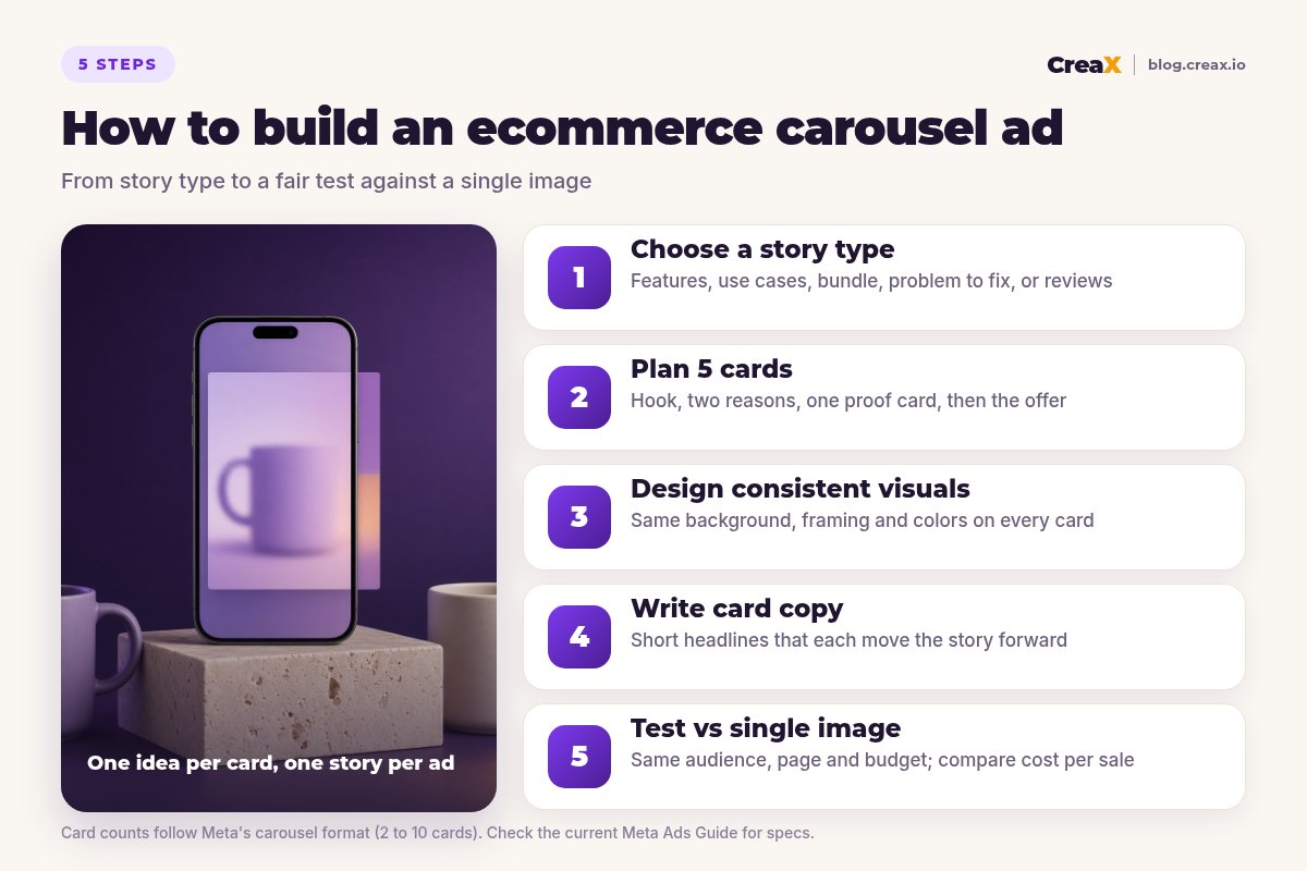
Meta lets you use up to ten cards, but more cards are not automatically better. Five is a practical default for ecommerce: enough to tell a complete story, few enough that every card has to earn its place. Plan each card on paper (or in a simple table) before you design anything:
Card 1: the hook
Card 2: the first reason
Card 3: the second reason
Card 4: the proof or detail
Card 5: the offer
★Watch the card order setting
Get studio-quality product visuals for every card
Paste a product link or upload an image and CreaX generates studio ad creatives, UGC-style video ads and a matching landing page in about 60–120 seconds.
Step 3Step 3: Design consistent visuals
A carousel should feel like one ad, not five. People decide in a split second whether to swipe, and a consistent look tells them the next card belongs to the same story. Keep these things identical across every card:
- Aspect ratio. All cards in a carousel share one ratio. Square (1:1) is the standard for feed carousels.
- Background and lighting. One color palette, one setting style. Swapping between a white studio, a kitchen and a beach makes the ad feel random.
- Framing. Keep the product roughly the same size and position, unless the card is deliberately a close-up.
- Text style. If you put text on images, use one font, one color and one position on every card, and keep it short.
You can also design across the cards: a panoramic image split into five squares, or a product that appears to slide from one card to the next. These can look great, but they take more design time and can feel broken if Meta reorders the cards, so turn off automatic ordering if you go that route.
Where the images come from
Most sellers don't have five matching studio photos for every product. You have three practical options: shoot them yourself, hire a designer, or generate studio-style creatives with AI from the product photos you already have. Our guide on studio ad creatives from one product photo walks through the AI route, and turning one product image into a week of ad tests shows how far one good image can go.
!Keep the product accurate
Step 4Step 4: Write card copy
A carousel has three layers of copy, and each has a different job:
- Primary text (above the cards): sets up the story in one or two short lines. Lead with the problem or the promise, not the brand name.
- Card headlines (under each card): short, specific, and each one adds a new reason. Read them in order; they should make sense as a sequence.
- Card descriptions and call to action: optional extra detail and the button. Keep descriptions brief, as they are often cut off or hidden on mobile.
A quick test: read only the five headlines out loud. If they repeat the product name or say the same thing in different words, rewrite them. Here is the difference:
| Card | Weak headline | Stronger headline |
|---|---|---|
| 1 | Ceramic Mug Set | Coffee that stays hot through your first meeting |
| 2 | Ceramic Mug Set | Thick stoneware walls, comfortable to hold |
| 3 | Great Quality | Dishwasher and microwave safe |
| 4 | Many Colors | Five glazes that match any kitchen |
| 5 | Shop Now | Set of 4, ships in 2–3 days |
Example copy for a stoneware mug set. Only claim what your product and supplier can actually back up, and use your real delivery times.
Write like a person talking to one buyer. Use numbers only when they are true and specific to your product (a real size, a real delivery time). Don't add fake urgency or ratings you can't show.
Step 5Step 5: Test vs single image
A carousel is not better or worse than a single image by default. It depends on the product, the story and the audience. The only way to know is a fair test:
Pick your benchmark
Keep everything else equal
Decide the metric before you start
Give it enough data
Keep the winner, iterate the loser
If a carousel gets clicks but no sales, the problem is often the page, not the ad. Check that the landing page repeats the story from the cards. Our list of creative fixes for Facebook ads that are not converting helps you find the leak.
Build the whole test in one pass
CreaX turns one product link into studio ads, UGC-style video ads and a landing page, so your carousel, your benchmark ad and your page tell the same story.
ExampleWorked example: a stoneware mug set
Say you sell a set of four handmade-style stoneware mugs in different glazes, and you want to test it on Meta with a small budget. Here is how the five steps play out:
| Card | Visual | Headline |
|---|---|---|
| 1 · Hook | All four mugs on a shelf, morning light, steam rising | Your morning coffee deserves a better mug |
| 2 · Reason | Close-up of a hand around the thick mug body | Thick stoneware, comfortable to hold |
| 3 · Reason | One mug in a dishwasher rack | Dishwasher and microwave safe |
| 4 · Detail | The four glazes side by side, same background | Four glazes, one matching set |
| 5 · Offer | The boxed set with the price and delivery time | Set of 4 · ships in 2–3 days |
Illustrative plan. Use your real product details, price and delivery times.
Story type: feature walk-through. Primary text: “Four mugs, four glazes, one set that makes your kitchen look put together.” Benchmark: a single image of the boxed set with the same text. Test: same audience, same landing page, equal budget, judged on cost per purchase after enough data.
If the carousel wins, the next test is a new card 1 (for example a gift angle: “The gift for the friend who lives on coffee”). If it loses, try a problem → fix story (“Tired of mugs that chip after a month?”) before dropping the format, provided you can back up that durability claim.
Common pitfallsMistakes to avoid
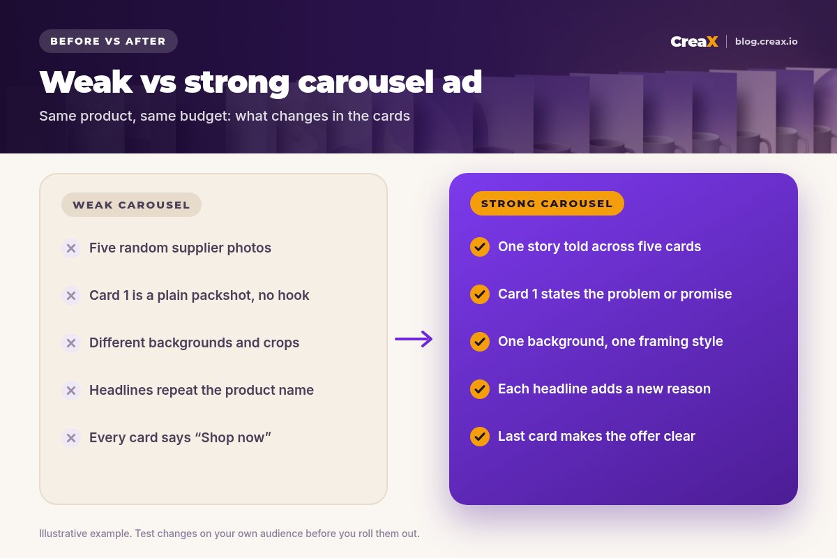
- Treating it as a photo album. Five photos with no story give people no reason to swipe.
- A weak first card. If card 1 is a plain packshot with no hook, most people scroll past and never see the rest.
- Inconsistent styling. Different backgrounds, crops and fonts make the ad look like a mistake.
- Repeating headlines. The product name five times wastes five chances to give a reason to buy.
- Linking every card to the homepage. Send each card to the page that matches what it shows.
- Calling the test too early. A carousel can start slower and finish stronger, or the opposite. Wait for enough data.
- Never refreshing. Carousels fatigue like any other ad. Our guide to ad creative fatigue signs shows when to swap card 1.
Before you publishChecklist
Carousel ad launch checklist
- ✓One story type chosen, written down in one sentence
- ✓Five cards planned: hook, two reasons, proof or detail, offer
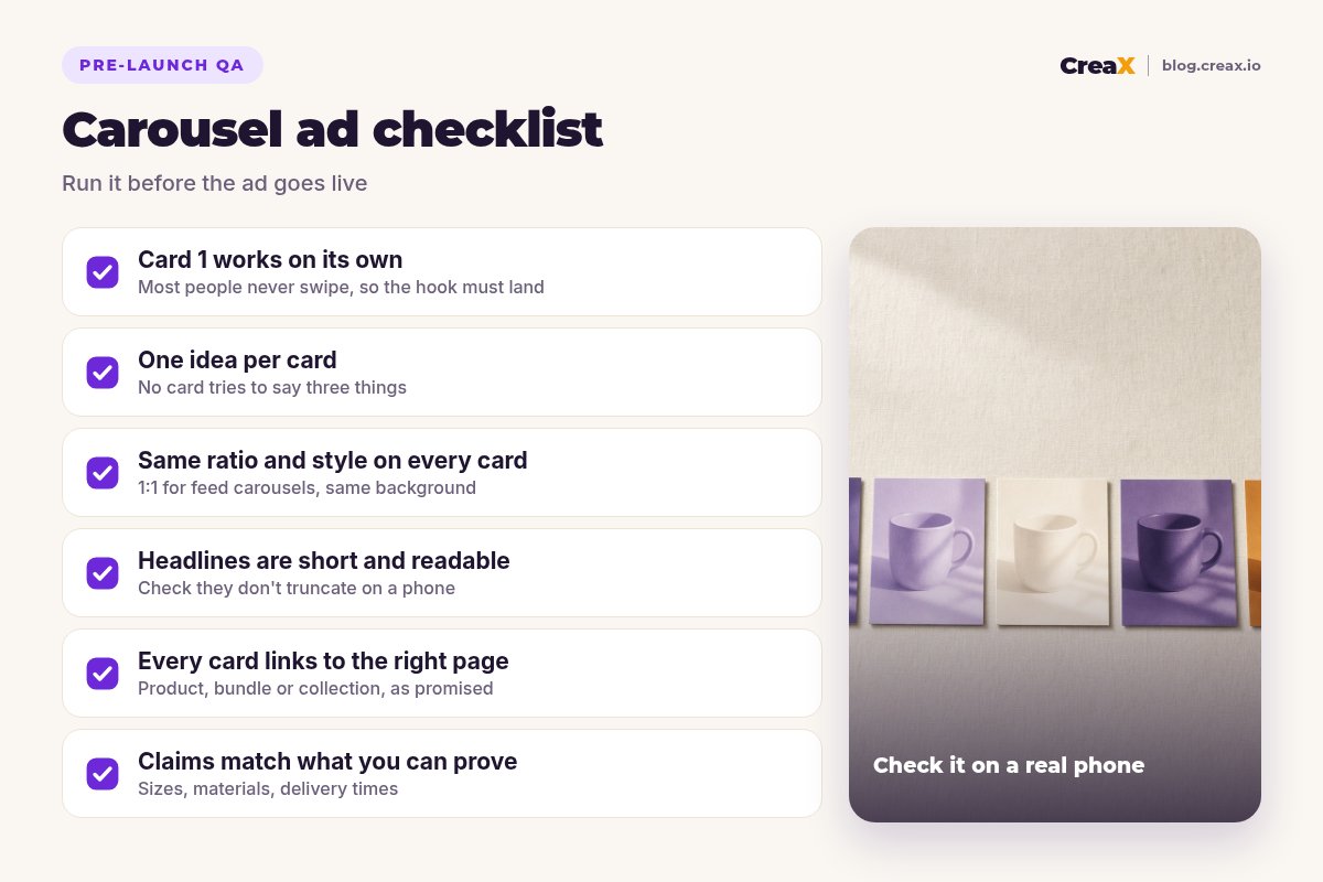
- ✓Card 1 makes sense on its own and shows the product clearly
- ✓Same aspect ratio, background, framing and text style on every card
- ✓Headlines read as a sequence and each adds a new reason
- ✓Every claim checked against what the supplier can prove
- ✓Each card links to the right page, and the page repeats the story
- ✓Card order setting checked if the story depends on order
- ✓Test plan written: benchmark ad, metric, budget and time window
FAQFrequently asked questions
Q.How many cards should an ecommerce carousel ad have?
Q.What size should carousel ad images be?
Q.Are carousel ads better than single-image ads?
Q.Can I use video in a carousel?
Q.Can AI create carousel ad images?
Q.Should every card link to a different page?
Ready to make your next carousel?
One product link, about 60–120 seconds: studio creatives, UGC-style video ads and a landing page that tells the same story as your cards.
This guide is published by CreaX. It contains general best practices, not guaranteed results, and no invented statistics. Ad specs and platform features change, so check the current Meta Ads Guide and your own results.