
How to Create a Brand Kit for Your Ad Creatives
How-to · Branding
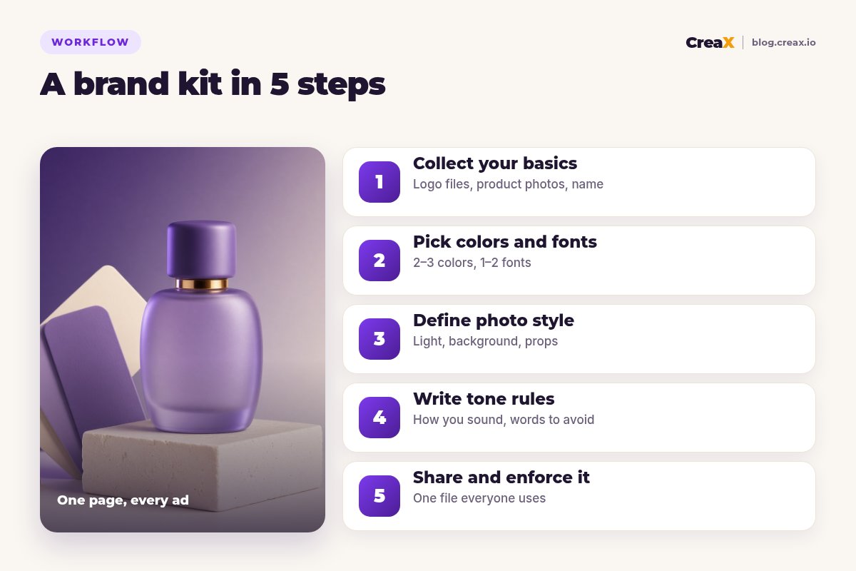
A brand kit for ads is a short, practical document that tells anyone making your creatives (you, a freelancer, a teammate or an AI tool) which logo, colors, fonts, photo style and tone to use. It does not need a design agency or fifty pages. In this guide you will build one in five steps, with a worked example and a checklist you can run on every new ad.
Updated October 2026 · By the CreaX team
Key takeaways
- ✓A brand kit for ads has five parts: basics (name, logo files, product photos), colors and fonts, photo style, tone rules and a way to share and enforce it.
- ✓Keep it small: two or three colors, one or two fonts, one photo style. Constraints are what make ads recognisable.
- ✓Write rules people and AI tools can follow: “headlines in sentence case, no exclamation marks” beats “friendly but professional”.
- ✓Check every new creative against the kit before it runs, whether a designer, a template or CreaX made it.
In this guide
The goalWhat you'll have at the end
By the end of this guide you will have one shared document, usually two to four pages, plus a folder of files. Together they answer every question that comes up when someone makes an ad for your store:
- Which logo file do I use, and where? Light and dark versions, minimum size, clear space.
- Which colors and fonts? Exact color codes and font names, with what each is for.
- What should product photos look like? Lighting, backgrounds, props and angles, with examples.
- How do we sound? Tone rules, words you use and words you never use.
- What must every ad include or avoid? Claims you can make, claims you cannot, and required details.
The point is speed and consistency. When the decisions are already made, each new ad takes less time, and your ads start to look like they come from the same brand. That matters more as you test more creatives; see how many ad creatives to test per product.
PrepWhat you need before you start
- Your logo in the best format you have (ideally a vector file such as SVG, plus PNGs with transparent backgrounds).
- Your best product photos, the ones you would happily put in an ad today.
- Five to ten ads, posts or pages you have already made, good and bad, to spot patterns.
- A few brands you admire, in or out of your niche, for reference (not to copy).
- A shared folder (Google Drive, Dropbox or similar) and one document to hold the kit.
★Start from what already works
Step 1Step 1: Collect your basics
Put every core asset in one folder with clear file names, so nobody uses a blurry screenshot of your logo again:
- Logo files: main logo, a simple icon or mark for small spaces, and light and dark versions. Note the minimum size and the clear space around it (for example, the height of one letter on every side).
- Brand name rules: how it is written (capitals, spacing) and how it is never written.
- Product photo library: one subfolder per product with the cleanest packshot, a lifestyle shot and a detail shot.
- Proof you can use: real reviews you have permission to quote, guarantees, certifications you actually hold.
- Required details: return policy summary, shipping promise you can keep, any legal lines your market requires.
Step 2Step 2: Pick colors and fonts
Fewer choices make stronger ads. Pick one main brand color, one or two supporting colors and a neutral (white, cream, near-black). Write each one down as a hex code, for example #6d28d9, so every tool gets the exact same shade.
| Role | Example | Used for |
|---|---|---|
| Main color | Deep violet | Buttons, key shapes, highlight boxes |
| Supporting color | Lavender | Backgrounds, secondary shapes |
| Accent | Amber | Small highlights only, like a badge or price |
| Neutral | Cream and near-black | Backgrounds and body text |
An example palette structure. Your colors will differ; the roles stay the same.
For fonts, one bold font for headlines and one clean font for body text is plenty. Choose fonts that read well small on a phone screen, and check you are allowed to use them commercially. If a tool cannot load your exact font, name an acceptable fallback in the kit.
!Check contrast on a phone
Step 3Step 3: Define photo style
Photo style is the part of a brand kit most sellers skip, and it is the part shoppers notice first. Describe it in plain words, then add two or three example images:
- Light: soft daylight, bright studio, or moody and warm?
- Background: plain seamless color, real home settings, outdoor scenes?
- Props: which are allowed (plants, linen, marble) and which are not (cheap plastic, clutter)?
- Angles: front packshot, three-quarter, close-up detail, product in use?
- People: hands only, full creators, or no people at all?
This section doubles as a brief for AI image tools. A sentence like “product on a cream stone pedestal, soft daylight from the left, violet backdrop, no clutter” gets far more consistent results than “make it look premium”. Our guide to studio ad creatives from one product photo shows how one good photo turns into a set of ads.
Step 4Step 4: Write tone rules
Tone rules keep your copy sounding like one brand, whoever writes it. Make them concrete enough to check:
| Rule | Do | Don't |
|---|---|---|
| Voice | “Keeps coffee hot through your morning” | “Revolutionary thermal technology” |
| Headlines | Sentence case, under eight words | ALL CAPS, three exclamation marks |
| Claims | Only what you can prove | “Best in the world”, invented numbers |
| Urgency | Real end dates | Fake countdowns |
| Words to avoid | Plain alternatives | Jargon your customers would not use |
Example tone rules. Write yours from your best existing ads.
Add a short list of phrases you like and a list of banned words. For copy structure, see our guide to Facebook ad copy for ecommerce.
Turn one product into on-brand ads to check against your kit
Paste a product link and get studio ads, UGC-style video and a landing page you can review and edit before anything runs.
Step 5Step 5: Share and enforce it
A brand kit only works if people use it. Make it easy:
Put it in one place
Hand it to everyone
Paste it into your tools
Check before it runs
Update it on purpose
ExampleWorked example
Say you sell a small line of fragrances online and run ads on Instagram and TikTok. Your brand kit might look like this:
| Section | Rule |
|---|---|
| Logo | Wordmark on light backgrounds, icon only in 1:1 ads under a set size, always with clear space |
| Colors | Deep violet (main), lavender (support), amber (accents only), cream (backgrounds) |
| Fonts | One bold sans-serif for headlines, one clean sans-serif for body text |
| Photo style | Bottle on stone or linen, soft daylight, violet or cream backdrop, hands only, no clutter |
| Tone | Calm and sensory, sentence case, no exclamation marks, no “best ever” |
| Ad rules | Real scent notes only, no invented reviews, same price on ad and page |
An illustrative brand kit, not a template you must copy.
When the brand makes a new batch of ads, the kit decides most of the questions in advance. In CreaX, for example, they paste the product link, choose among the five ad styles (Classic, Humble Orbit, Punch, Luxe and Meta Feed) the one that fits their kit best, generate statics in 1:1, 3:4, 4:5 and 9:16, and then check each result against the kit before launch. Our guide to CreaX ad styles explains each style.
MistakesMistakes to avoid
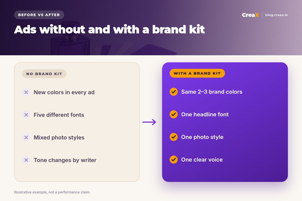
- Too many options. Six colors and four fonts is a menu, not a brand.
- Vague rules. “Modern and clean” means something different to every designer and every AI tool.
- No photo rules. Mixed lighting and backgrounds make even good ads look like they come from different shops.
- A kit nobody can find. If it lives in someone's downloads folder, it does not exist.
- Never updating it. Your ads teach you what works. Fold the lessons back into the kit.
- Branding over clarity. A beautiful ad that hides the product or the offer still fails. Clarity first.
Copy thisChecklist
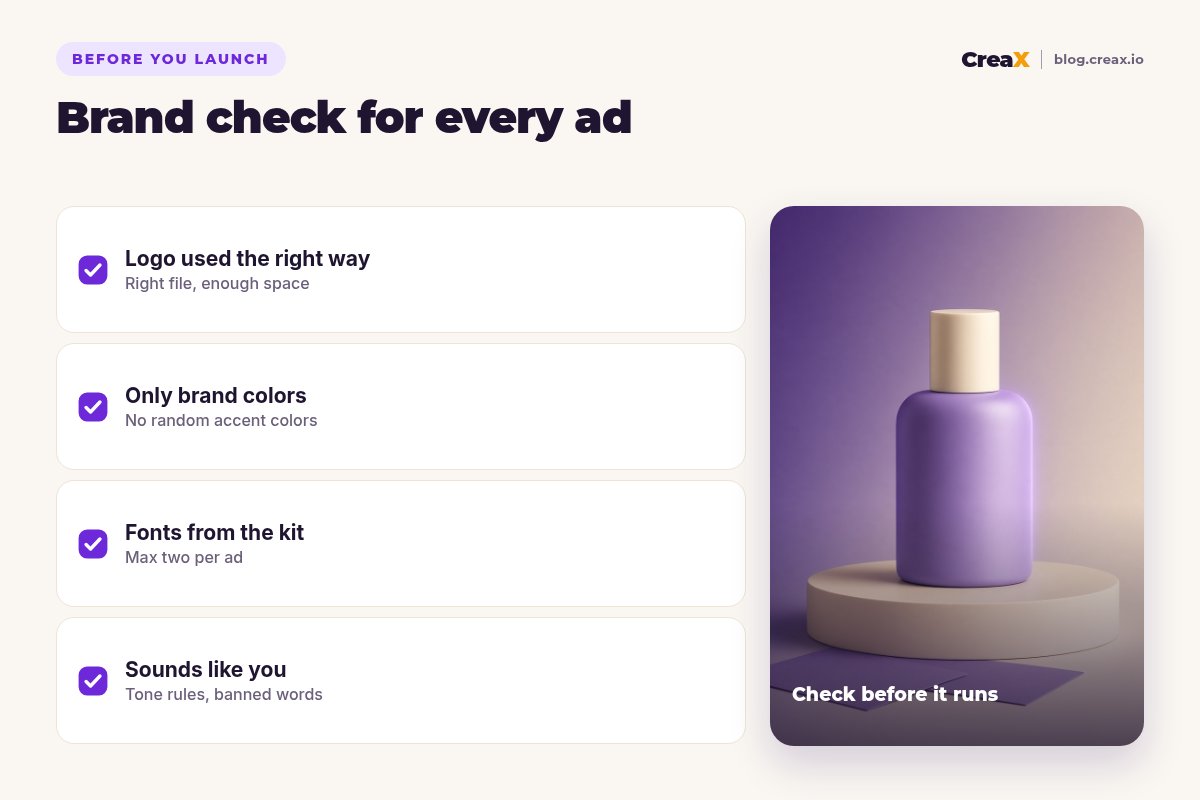
Your brand kit is ready when…
- ✓Logo files in light and dark versions, with minimum size and clear space written down.
- ✓Two or three colors with hex codes and a role for each.
- ✓One or two fonts with fallbacks and commercial-use rights checked.
- ✓Photo style described in one or two sentences, with example images.
- ✓Tone rules with do and don't examples and a banned-words list.
- ✓Ad rules: claims you can make, required details, things you never say.
- ✓One shared link that everyone, and every tool brief, uses.
For layout rules that sit on top of your kit, see how to design a static ad that converts, and for the right dimensions per placement, read ecommerce ad creative sizes.
Make your next batch of ads in minutes
One product link, about 60–120 seconds: studio ads in five styles and four sizes, UGC-style video and a landing page to check against your kit.
FAQFrequently asked questions
Q.What is a brand kit for ads?
Q.How long should a brand kit be?
Q.Do I need a designer to make one?
Q.How many brand colors should I use?
Q.Can AI tools follow a brand kit?
Q.How often should I update my brand kit?
Ready to put your brand kit to work?
Paste a product link and get on-brand ads, UGC-style video and a landing page in about 60–120 seconds.
This guide is published by CreaX. Examples are illustrative; check font licences and the advertising rules of each platform you use.